I have had a few pinch me moments in 2021, and the next one that has me wondering how I got here is being chosen to be a featured designer for the One Room Challenge. I had just finished seeing our actual 10 page spread in HGTV Magazine for the September 2021 issue, when I got the email from Linda Weinstein, the founder of the One Room Challenge. I could hardly believe it, but I had worked so hard to get to this point, so truthfully, I know I deserved it. Back in 2018, I reluctantly joined the One Room Challenge as a guest participant and I was so surprised with the outcome and how much attention that room received. I made over my daughter’s bedroom in our last house and she loved it so much, I decided to redo it here in this home using the exact same wallpaper and furnishings. So, without further ado, my One Room Challenge, will be our basement playroom.
WHAT IS THE ORC?
First off, what exactly is the One Room Challenge? Twice a year, 20 designer/bloggers are selected to participate in a design event that spans 8 weeks. We have 8 weeks to complete a space to it’s utmost potential and we have amazing brands sponsoring us. I am so honored to be one of these 20 featured designers this Fall. Thank you to Linda for reaching out to me and working so hard to produce this design event. Better Homes & Gardens is the media sponsor for this event.
MY INTRO
In case this is your first visit to my website, my name is Reem and I am a local ‘decorator’. When we built our last house, neighbors would come visit me and beg me to come design their homes. So, I finally started up a small business after leaving my career of teaching. I always knew I had a knack for creative design in different spaces and so I started an Instagram page 6 years ago, and here I am. I have helped clients in surrounding neighborhoods redesign and decorate single rooms to entire floors. Since then, we sold our last home that we built and we stumbled upon this 100 year old gem and I have been busy updating it.
THE ORC SPACE
I have many beautiful, magazine worthy rooms in our vintage home, but the one room I could hardly stand to walk into is my kid’s basement playroom space. So, that brings us to the area I will be redoing. I almost decided against this space because I knew it was not photograph friendly. With hardly any natural light and lower ceilings, I knew this space would be a challenge. But, at the same time I wanted to inspire others that have challenging spaces to make the most of their rooms. Also, I wanted to do this for my kids, they deserve it, and they spend more than half their life down in that space, lol.
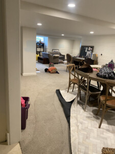
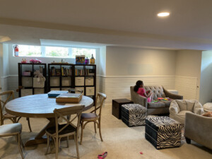
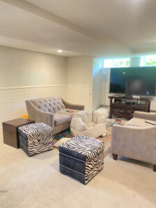
These before photos are cringe worthy. They make me gasp and I am a bit embarrassed. But, here is the before, just so you can understand the depth of my design disappointment in this space. It, unfortunately, has been reduced to a furniture graveyard for old, rejected, mismatched, never loved articles of decor and furniture. Let’s just all agree to just say it is a very “lived in” space. As you can see, my kids still play in the space and it doesn’t even phase them. However, my 11 year-old one day told me, “mama, can you make this playroom really cool like the rest of the house”? And so, my mom-guilt kicked into high gear.


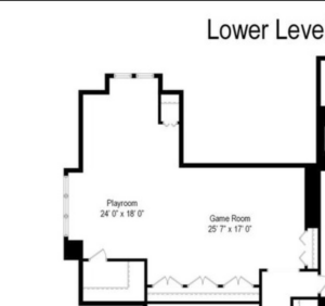
Before we get into the actual design of the space, let’s talk about the layout.

As you can see we have a pretty big space. I love the shiplap that runs along the entire wall. But, I feel like it is lost in the space and it doesn’t make an impact, the way it can. The paint color above the shiplap is dingy and almost looks dirty. That color just does not work in the space. Also, I knew I needed to divide the space up somehow. The video gaming area will be in the “playroom”space above and the the “game room” area will have a crafting area and desk for my creative illustrators. The only furniture I will be keeping is the Restoration Hardware desk and round table. Everything else is going. Everything…Ok, maybe I will be keeping one organizer for toys, just one. But, before we do anything, there is a whole lot of purging to be done, so let’s get to it.
Stay tuned for the moodboard reveal in Week 2 and the direction of design that I will be heading in. I will also be sharing all of the wonderful brands that I will be working with and exactly what I will be doing to complete this space. Just a warning, this space will be very different from the rest of my home, but I look forward to going outside my comfort zone a bit, and when I say that, I mean, doing something that I normally don’t do, which is using color. Now, head on over and check all the featured designer’s posts.
,Albie Knows| ,At Home with Savvy | ,Beth Diana Smith | ,Eclectic Twist| ,Erika Ward Interiors n,From House to Home| ,G. Lebron Interiors | ,Goldalamode | ,Home Made by Carmona| ,Impeccable Nest ,Jeweled Interiors| ,Joyful Designs Studio| ,Joy Street Design | ,Our Fifth House| ,Peony & Honey ,Pinch Plate Party | ,Rebecca Propes | ,Reem’s Design | ,Saudah Saleem Interiors | ,Whitney J Decor Media ,BH&G | TM ,ORC

